Steel Beasts Pro
Personal Edition
March 12, 2006
Page 1: Introduction Page 2: Opening Shots Page 3: Graphics Page 4: Sound Page 5: Mission Edit Page 6: Vehicle Park Page 7: Game Logic Page 8: Gameplay Page 9: Stability Page 10: Summary
Page 3: Graphics
GRAPHICS
Gone are the days of 640x480 resolution, 256 colors, software mode only! The graphics deliver very adequately and can be freely adjusted up to 1600 resolution. I played with 1024 resolution for the main and for comparison and playability tests with 1280, the angular speeds were a bit lower in the higher resolution, but by far no show-stopping differences I found. Driving the tank, angular speeds are something you do not need to think of, they only come to your mind when you are aiming and moving the turret quickly to a nearby target that is moving by closely, resulting in a fast change of angles. Ssnake (technical director of eSim and ex-tanker himself) recommended preferring a lower resolution of 800 if this is needed to get ansitropic filtering and anti-aliasing working.He thinks vehicles and especially their antennas look better that way. A question of taste, I think, if forced to make a selection I would prefer it exactly the other way around – higher resolution and no AA or AF. I tried AA and AF at 2x, but the graphical gain was minimal, where frames lost immediately one third. But the landscape graphics in SBP I found to be so good that even without AF and AA I am absolutely stunned by the way the environment is visually represented! It looks very, very good, and I really do not miss AA or AF concerning the landscape. Vehicles of course show some more contrasting lines without AA/AF or flickering antennas and that’s all the disadvantage I see. For 95% of mission time I am not aware of it. Frames never were an issue with 1024 and no AF and AA.
On my system I always had fluid movement even when I set up a quick skirmish that involved several companies of tanks all in viewing range, firing wild in one hotspot of limited size, or when observing via player camera an amateurish setup of a two company-assault line of tanks that was approaching a perimeter defended by an equal-sized force plus artillery barrages (idiotic, I know…). Months ago there have been reports from players or beta-testers somewhere that even a setup with two battalions massing in one small area resulted in slightly slower but still fluid, fully playable frames. I haven’t checked that size of a mission. The biggest thing I had were five or six companies I just scattered around near a village and then frantically started combat while I was enjoying the show, inclusive several artillery bombardments – graphically it worked well. From what I have seen so far I am confident that the sim would even handle a brigade-sized force stretched out over an according wide front at acceptable frame rates. Even when under attack and attacking vehicles and "flying objects", graphic effects and missile trails are adding to the overall calculation of the CPU and graphic-board. But for that maybe a stronger system than mine would be needed.
But I do not see any need to set up such scenarios. Two or three companies is more than most of us will ever be able to handle, believe me. There is a reason why the military gives you a single vehicle to command first and only later eventually a section or platoon.
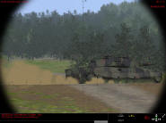
You don’t see all that colorful eye candy you used to see when playing Unreal Tournament but having said that SBP still does a very competent job in creating the visual representation of a natural battlefield with realistic viewing conditions and ranges. So far the sim presents desert terrain and wooded terrain (Europe-style, in summer/, autumn and winter). Mods for new terrain sets can be expected. The up and down of the terrain’s surface is well modeled and gives you a very realistic feeling, no matter if it is desert or green plains, hills and ridges or rocky valleys. Maybe you have seen the screenshots of the recreation of the Grand Canyon area some months ago. There is some diversity in the vegetation now and you have real riverbeds and bridges, side-roads and major traffic lanes. Visibility ranges can be freely adjusted that give the impression of dust or haze in the air. You can fight in conditions where you wouldn’t see your hands in front of your face, if you want. With growing distance colors and contrasts fade, giving you a superb feeling of depth. Viewing distances in the SB world are huge and – assuming no obstacles hinder your view - must be measured in kilometers. Five km under best atmospheric conditions are the limit, I estimate. You will not see a "wall of nothing" at 2 km like in so many other games or in flightsims when they render the clouded sky and there is a sharp line where the clouds end. The terrain graphics supply you with exactly the perceptions and viewing ranges you need to have when doing mechanized warfare on the ground, the feeling of distance is very good. I personally like the color palette, too. It is missing the oversaturated poison-green and electric-blue and citron-yellow colors you see in games so often, but paints the world in more realistic pastel colors with far lesser saturation. Textures for ground come in various incarnations and add the needed diversity to make the terrain look realistic. Buildings also have more diversity now than in SB1, although if creating a settlement they soon become repetitive. But they do their job and they do it in a solid way. All in all I must say I like the Steel Beasts world and the way it was graphically created. It gives you a good reason to fight for the ground you are rolling over.
Vehicle models are very detailed and are equipped with detailed textures that come in three sets of camouflage patterns: woodland, winter, and desert. These fit the four types of environment there are: woodland (which means not only European woodland, but also Asian style, so eventually you want to yell out Good Morning Vietnam!, and the Australian bush), autumn, winter/arctic, desert. Especially certain terrain formations in winter give some spectacular, very realistic visual representations. Sub-versions of vehicle types with different weapons or special equipment are easy to recognize. Of course all models are fully animated with moving tracks and turning wheels, realistic weapon movements (although still no main gun recoil), opening and closing hatches, dynamic "hops" of a tank firing its cannon and the recoil making it – well, as I said, making it hop a bit. You will easily identify a vehicle at far distance by its unique silhouette and design (as long as it is not hiding in dust, fog, or vegetation). I like this zoo of the Steel Beasts very much. It looks very alive.
What I also like is how well colors of the landscape and vegetation and camouflage patterns of the vehicles fit together. Camouflage is not only cosmetic in this sim, it really does its job. I often found the contrasting silhouettes of vehicles to soften up and disappear when I watched them being parked in a line of woods or with a forest as a background. This is because the contrasts are fading over distance but even from closer ranges the camouflage pattern help to fool the eye to a degree that I have not seen before in any sim. Spotting is difficult in SBP, and even more so if trying to spot infantry over distances where the TIS (the thermal image system that displays objects by their heat-signatures) is of no use. Even when they move around and I use optical magnification I have difficulties to recognize the presence of troops in that forest.
While tanks blend nicely into the background level of bushes and forests, on other occasions, on the other hand, I saw lighting conditions when shadowed sides of vehicles became too dark to be believable and thus the tanks showed up with too much contrast, compared to the background, especially in open terrain (light grass for example). This really seems to be an art that so far most sim developers seem to be unable to master: objects often are too bright or too dark. To balance the contrast between shadowed and lightened aspects of objects that way that you get a believable visual impressions – no matter what the environment‘s viewing and light conditions are, seem to be very tricky. Maybe a more complex and in-depth simulation of biological eye adaptation to changing lighting conditions is in need here. Ironically Ssnake once has asked me about exactly this, maybe three years ago or so (back then I laughed and told him I even cannot dream on a method how this could be achieved and that he should ask a former friend of mine, an eye doctor – but maybe it is just my missing fantasy when it comes to things that can be done with a good software code).
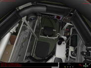
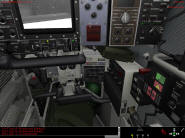
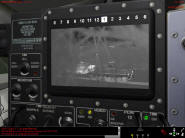
The Leo2A5 has a complete 3D-interior, with great detail and even some mouse-clickable buttons in the commander’s position. The Abrams and Bradleys also have 3D-interiors for their commanders but there is not so much to see and to use in these vehicles as in the Leo2A5. The number of vehicles offering this feature is expected to increase in the future. You can move your head freely, pop your head out of the hatch or dive back into the depth of your tank. Think of it as the kind of cockpit you get to see in the IL-2 series, or a racing sim like GTR with free movement and free zooming. By that you get full immersion if you play a mission completely from your station, because the commander has useful instruments and displays in that view that are fully usable – you can fight from there, it’s not just a gimmick for illustration purposes. Controls and buttons are clickable via mouse button (they are also linked to keyboard commands). It’s a very cool feature and it is very well implemented. Even many American Abrams-lovers probably will spend much time in the German beast because of the 3D-cockpit in the Leo being more detailed or complex than in the Abrams. Leo2A5-commanders also will benefit from having an optical periscope and a black/white co-monitor available (the M1A1 commander has neither this nor the IVIS system). In this context I just note here that you have three different thermal vision colors available in the game, depending on the vehicle platform you are using: black/white (Leo2 TC), green/white (Abrams, Leo2: commander, gunner), and red/black (Bradley). Polarity can be changed for all.
There is a driver’s seat for most of the vehicles now you do not see much through the three prisms, but it is enough. As a workaround the driver’s position can be used "unbuttoned", too, then the cockpit bitmap disappears and the mouse is used to look around. It’s not completely realistic but maybe a better compromise. I personally do not see the point to play a mission from that position. But racing around in a Hummer (now, that one of course has no prism sights…) is some kind of fun.
Weapon effects are showing some more diversity now and together with the frightening loud and realistic sound they give you some show for your money. I raised an eyebrow when I saw for the first time a round falling short off my target – and was reflected from the ground and bounced off the earth, ricocheting into the air and high above the target. However, one has to admit that this sim is not an FX show like many action games out there, this kind of stuff simply is not ranking high on its priority list. Explosions for example are a little bit limited and small in their scope. Burning tanks also produce fires and smoke trails of that somewhat limited size, and not more. You see tracers, and sparkles and ricochets when hitting armor with smaller caliber fire. Effects like dust trails from driving in dry terrain, or artillery impacts also are functional only and give you the needed representation of events in a functional understanding but they do not look really spectacular. The smoke covering from artillery barrages was thicker and more covering in SB1 than it is in SBP, although the single clouds look better now. I know that kind of event only from TV pictures and SBP does not appear to reach the intensity of that visual effect of smoke from artillery.
Effects definitely are not like Unreal Tournament in visual performance but what you need for a solid immersion experience is all there in terms of scope and range of effects. They are a little bit clinical in appearance and design, a little bit too sober, maybe, or cartoon-like in style, the transparency effects of smoke and dust are by far not state of the art. But while they are lacking the finesse of what can be done today in these regards, they are substantial and solid if taken for themselves and not comparing them to gfx-gimmick-games from the shelves, and no one plays a study sim like this for visual action effects only. The sim has been made for a very different market than the usual player/customer, it has been made for the real military, and that customer is not so hot for graphic candies. I cannot complain about anything in the graphics, although I can imagine how to make many things better – at the cost of probably lowering the frame rate. SBP has a very good balance between graphics and frames, obviously some thought into what needs to be seen and what is graphics are affecting the CPU with little gameplay improvement. I myself like it, and the sight of complex landscapes that are possible is very convincing. It is important to understand that SB2 will see more resources spend on graphics, and these improvements may be added to SBP as well when they are available. SBP is planned for years of constant support and updating, says the developer.
Infantry comes in many different types, some months ago someone wrote in a preview he counted 40 or 50 different types. I have not counted them myself, but although I saw a very diverse set of grunts, these numbers maybe were exaggerated. At least there are grunts with normal weapons and grunts with AT-weapons. In the editor you can select uniforms for over a dozen different nationalities. So, there seem to be a good amount of diversity, at least visually - if the differences always are so very obvious is something different: you hardly will have the time to admire their outfit once the action has started. They are still bitmaps, which first sounds like a critical thing, but it is not really. If you have infantry that close to your tank that you could see a difference between polygon-made infantry and bitmaps then you surely are already in deep trouble. Animation is a bit blocky and – which is one of the small criticisms I may voice – a bit slow, the way they move definitely does not look convincing to me, this aspect of the sim could need some substantial rework. However, they do look much better than the old SB1-comrades of theirs, the improvements went as far as to different uniforms and equipments, different faces (some seem to have beards, cool), better animation, so it is okay enough for the duty they are to fulfill within the simulation’s context.
Infantry is confirmed to be planned for both visual and AI improvements in the next update, it will be brought to polygon-level.
Complete day-and-night-cycle unfortunately is not yet implemented but it is on the list, so may be added in a later add-on, the same with weather effects like rain, storm and fog. Weather effects like fog and rain will affect the sim both visually (what you see on monitor) and gameplay-wise (how the AI is affected by visual conditions). While you may think missing weather and day-and-night is a major issue, I remind you how well the old Steel Beasts played without these two factors, and the future of SBP holds sweet promises for us. Shadows also are not implemented yet, but surprisingly – I do not miss them, that good things already look. In forest they would be nice, to make forest a little bit darker, but in the open – shadows are not a priority for me.
All in all I find the graphical presentation to be adequate, to say the least, with the vehicle models, 3D-ground surface modeling and vegetation very well done, and special visual effects being solid, but not spectacular. We also know that more good stuff (weather, light-cycle) is coming. But by no means you should take the latter two remarks as an indication that the gap between gameplay and graphics is as wide as was the case with SB1, which offered a graphics-engine that already was hopelessly outdated at the time of its release. I said the graphics in SBP are adequate, and I exactly mean it like that. They do the job that they should do from the perspective of a serious classroom simulation, so there is nothing to really complain about, and the sim gives a very good overall presentation of the world. With the already implemented things I can imagine to improve many of the graphical effects, but in no regard the sim does "suffer" from the current visual condition it is in. Solid, with room for improvements.
Next: Page 4: Sound
Page 1: Introduction Page 2: Opening Shots Page 3: Graphics Page 4: Sound Page 5: Mission Edit Page 6: Vehicle Park Page 7: Game Logic Page 8: Gameplay Page 9: Stability Page 10: Summary
****** Updated regularly ******
Want to know when patches are available?
Want to be informed of the latest breaking Steel Beasts news?
Sign up for the Tanksim Newsletter!Copyright © 2006 Tanksim.com


